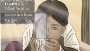
In the fields of Odisha, heat is not just a weather condition. For many women farmers, it is something they work through, carry on their bodies, and quietly endure through long hours of transplanting, weeding, harvesting, walking, waiting, and returning home to more unpaid work. The issue is visible in the sun, the fields, the exhaustion, and the changing climate. It is also invisible in the choices women are forced to make, such as drinking less water because there are no safe toilets nearby, continuing to work without rest, or ignoring signs of heat stress because livelihood cannot pause.
When the International Rice Research Institute (IRRI), a premier nonprofit agricultural research center dedicated to reducing poverty and hunger through sustainable rice science, approached us, the task was not to simply design another awareness booklet. The brief carried research, field insights, survey points, and the lived realities of women farmers facing extreme heat. Our role was to transform that information into an illustrated narrative that could be understood quickly, felt deeply, and remembered after the page was turned.
Finding the Story Inside the Research
The writing process started when we were provided with data from IRRI, which helped us understand what was going on with women farmers, the existing coping strategies, and the areas where the support system needed improvement. However, research alone does not automatically become communication. It has to be shaped carefully so that the reader does not feel lost in data or distanced from the issue.
The story needed to show the severity of heat stress, but it also had to show that this was not an abstract climate concern. It was about work, health, water, sanitation, clothing, rest, access to information, and policy planning.
We studied the survey points and pulled out the strongest communication threads. The story needed to show the severity of heat stress, but it also had to show that this was not an abstract climate concern. It was about work, health, water, sanitation, clothing, rest, access to information, and policy planning. Additionally, we looked at verified external facts where needed because numbers can help establish urgency when used responsibly. The idea was not to overload the reader with statistics, but to make it clear that the problem was real, documented, and already affecting women’s lives.
Also read: The Art of Impact: Exploring Illustration Styles in the NGO World
Writing With Clarity and Emotion
The final script was written in short, direct lines because the booklet had to work visually. Each page needed one clear thought. Too much text would have weakened the illustrations, while too little context would have made the story feel incomplete.
Each page needed one clear thought. Too much text would have weakened the illustrations, while too little context would have made the story feel incomplete.
We wanted the writing to move from problem to response. The first part explains the crisis and the dangers of dehydration, fatigue, kidney disease and unhealthy working conditions. Then it goes on to highlight the efforts made by women to counter these problems through scarves, bamboo hats, timing for work, cooler foods, and water. Moreover, the booklet introduces practical home and community-based measures, including reflective paint, bamboo roofing, wet jute sacks, shade, cooling stations, and safe drinking water.
The closing pages then move towards systems. This was important because the burden cannot remain on women alone. The script slowly introduces the Rural Heat Action Plans, training of the frontline workers, earmarked budgets, inter-departmental coordination and inclusion of women farmers in the planning. The final question was written to leave readers with responsibility, not just sympathy.
Building the Visual Language
The illustration process began with references. The team studied images of rice fields, women’s work clothing, postures during agricultural labour, field conditions, heat exposure, and rural settings. The first storyboard explored a more photo-based direction using cut-outs and manipulation, but the final visual language moved towards full digital illustration.
This choice helped us create a more cohesive emotional world. The characters could be drawn with controlled expressions, body language and gestures that matched the script. The illustrator eschewed strong outlines and adopted a softer, more textured style. Although the visuals are illustrative, they remain grounded in real environments and familiar rural details.
Although the visuals are illustrative, they remain grounded in real environments and familiar rural details.
The colour palette was also a deliberate decision. Since the subject was heat stress, the pages needed to feel warm, dry, and slightly uncomfortable without becoming visually harsh. Muted yellows, dusty greens, oranges, browns, pale blues, and soft reds were used to suggest heat, fields, fatigue, water, shade, and relief. Furthermore, the grainy texture across the booklet gave the visuals an earthy quality, making the piece feel closer to field realities than to a polished corporate explainer.
Also read: Designing ARMMAN’s Annual Report Through Illustration
Designing for Understanding
The booklet was designed so that each spread carried one idea clearly. Some pages are emotional and scene-led, showing women bending in fields, resting, drinking water, or facing exhaustion. Other pages are more informational, using circles, labels, numbered points, and visual callouts to explain solutions.
By combining human scenes with simple explainers, we could show both the reality of the issue and the practical steps that could help.
This balance was central to the communication. A fully emotional booklet may have felt heavy. A fully informational booklet may have felt distant. By combining human scenes with simple explainers, we could show both the reality of the issue and the practical steps that could help.
Why This Work Matters
Projects like this are labour-intensive because they ask for more than attractive visuals. They require research reading, script development, fact selection, sensitivity, visual referencing, storyboarding, illustration, layout, and repeated alignment between message and design.
For us, the purpose was clear: to help people see the heat that women farmers are carrying, both on their bodies and within the systems that surround them. Through this booklet, IRRI’s research became a visual story that could speak to policymakers, development professionals, communities, and readers who may never have stood in those fields, but need to understand why this issue cannot remain unseen.