When Sumitra Devi from Manatu village in Jharkhand became pregnant for the first time, she found herself navigating the journey without the guidance of her late mother-in-law. That’s when a local ASHA worker introduced her to Kilkari—ARMMAN’s voice-based mobile service. Through weekly calls, Sumitra received vital information about nutrition, hygiene, and immunisations, all delivered in a comforting, familiar voice. To her, Dr Anita—the fictional doctor behind the Kilkari messages—became more than just a voice; she became a steady source of care and reassurance.
Now, Sumitra is the proud mother of a four-month-old healthy baby. These are not merely moments of impact—these are the essence of ARMMAN’s work.
Our Design Approach
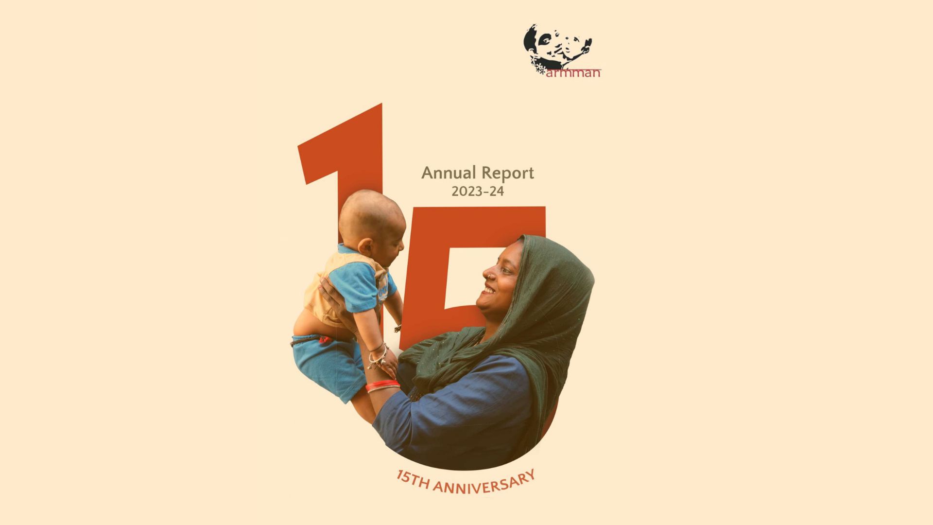
When ARMMAN came to us to create their 2023–24 annual report, we knew we had a chance to create something impactful and innovative. They had completed 15 years of their operations. So, our goal was to present ARMMAN’s incredible work in an interactive and engaging way and at the same time highlight this milestone. So here are a few ways in which we did it:
Highlighting Key Numbers
We were working with a lot of information. ARMMAN had a treasure trove of data: crucial statistics, program achievements, and impact numbers. The challenge wasn’t just what to include but how to present it without losing the reader. Each number told a story and deserved to be noticed. For example, we used bold, oversized fonts to highlight statistics such as “46.4M women and children reached till date”, and “380K+ ASHAs trained till date.” These figures were carefully placed with contextual narratives so that even if someone just skimmed through, they wouldn’t miss it.
The challenge wasn’t just what to include but how to present it without losing the reader.
Celebrating a 15-Year Milestone
Fifteen years is a big milestone, and we didn’t want that to go unnoticed. We wove the number into the visual language of the report. You’d find it behind key images, in the founder’s note, and even on the cover. This added consistency but also gave the report a aesthetic feel without going over the top.
Enhancing Information Through Infographics
Some of the most impactful information was also the most complex, which becomes meaningful when presented visually. We created a detailed timeline infographic to highlight important moments in ARMMAN’s 15-year history. In order to give stakeholders clear, detailed insights into their training and decision-making processes, flowcharts were specifically used to highlight various programs.
Mapping ARMMAN’s Reach Across India
We wanted the map of India to do more than just show locations. It needed to reflect ARMMAN’s reach in a clean, thoughtful way. The simplified, uncluttered design highlighted states like Maharashtra, visually marking regions of high impact and ongoing programme implementations. The strategic use of icons and clear legends provided viewers with intuitive insights into geographic coverage and scale.
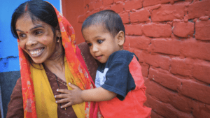
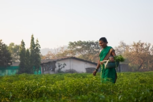
Integrating Photo Cut-Outs
We avoided using full-page photographs. Instead, we worked with photo cut-outs showcasing genuine moments captured among beneficiaries, healthcare workers, and ARMMAN’s dedicated team members. This style gave the report a lighter, more modern feel. The images blended into the design ensuring the stories remained front and center without overpowering it.
In the end, our job was to make data approachable. But more than that, we wanted readers to feel something. This wasn’t just a report—it was ARMMAN’s story. And we were proud to share it.

The Effect of Thoughtful Design
The aim was to let readers understand the main points at a glance while investigating further details if they wanted. And ARMMAN and its stakeholders had a really positive reaction overall.
Shweta Thampan, Senior Communications Manager at ARMMAN, felt that the design process was smooth and collaborative. “They’re so easy to work with,” she noted, “thanks to their quick responses, minimal feedback, and handholding.” Her comment underscored how, when combined with clarity and purpose, design can become a universal language connecting different teams.
“They’re so easy to work with, thanks to their quick responses, minimal feedback, and handholding.”
This project showed that careful design can make complex things simpler, add a human touch to data, and showcase genuine impact. As design trends shift towards interactivity, motion, and personalisation, we’re passionate to explore new ways to tell powerful stories.
We at Simit Bhagat Studios turn complex information into powerful stories. Ready to turn your annual report into a narrative that engages stakeholders? Let’s talk about how our design approach can highlight your success and engage your audience.