Sejal Ramane wakes up before sunrise, walks kilometres to a bus stop, and still finds her way back to her books. When she scored 91.40% in her exams, it felt like a personal win, but it also carried an older promise. Years before Sejal, her mother Riddhi studied in the same school. When money ran out, teachers visited her home and assured her parents they would support her education with books and clothes. In Chikhalgaon, education has never been a neat transaction. It has been a relationship.
“My financial background was very weak, but the teachers assured my parents they would support my education.”
— Riddhi Ramane, Student, Loksadhana
Stories like these explain why Loksadhana’s work matters, and why telling it well matters too. Chikhalgaon is the birthplace of Lokmanya Tilak, a leader remembered for championing education and building schools across India. Yet in 1982, the village itself still lacked a secondary school. Children walked long distances for classes that ended far too early, and many dropped out. The gap was not just about infrastructure. It was a quiet reminder of how unevenly opportunity spreads.
When Dr. Raja and Prof. Renu Dandekar arrived, they did not come with a packaged model. They came with questions. What would make families stay instead of migrating? How could education lead to livelihoods? Their answers were rooted in listening and building rural solutions for rural problems. That conviction became the seed of Loksadhana, an institution shaped by the very ground it stands on.
That is the story. The question for us was, how do you translate a story like this into a website that people actually feel?
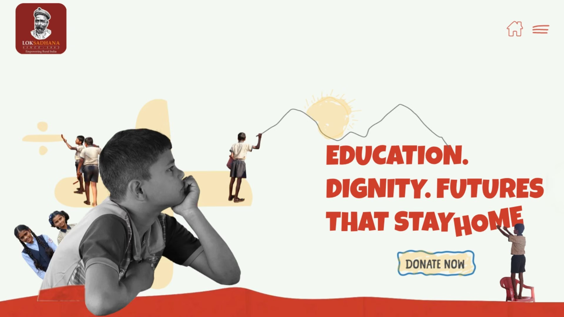
Loksadhana reached out to us because their earlier website had begun to feel like an old folder. It held information, but it did not communicate their work impactfully. It did not reflect the scale of what they had built, or the lived texture of their work. For an organisation operating in a small, remote geography, the website often becomes the first point of contact for supporters, partners, and people who may never visit the campus. Loksadhana wanted their digital presence to carry the same dignity and depth that exists on the ground. We did not approach the revamp as a layout exercise. We approached it as a narrative translation.
Also read: The Art of Impact: Exploring Illustration Styles in the NGO World
Building a Website Like a Guided Walk Through a Life’s Work
Our starting point was a simple decision. The website should not read like a brochure. It should feel like the founders are walking alongside you, telling you how it began, what they noticed, what they tried, and how the work kept expanding. This meant writing and designing in a way that carried continuity.
The website should not read like a brochure. It should feel like the founders are walking alongside you, telling you how it began, what they noticed, what they tried, and how the work kept expanding.
Instead of standalone headings, we used connector headings that behave like sentences in a story. You do not just see a title, you see a turning point. Lines like “But then came the need for more…” and “So we started…” become narrative bridges. They pull the visitor forward the way a voice does, and they prevent sections from becoming isolated blocks.
The Education page became the clearest example of this method. The visitor moves through the evolution of learning in Chikhalgaon as a flowing sequence. Secondary school is not presented as a programme. It is presented as a beginning. Then the need grows, so the story grows. Primary education appears as a response, then the story expands again into higher secondary education. The visitor is not collecting information. They are following cause and effect.
The impact numbers appeared like a checkpoint in a longer journey, anchored in a human context.
To make sure the numbers did not feel like a sudden corporate interruption, we treated impact metrics as milestones rather than a statistics wall. Meals served, alumni numbers, resident students, educational infrastructure, student-led businesses supported, each figure appears like a checkpoint in a longer journey, anchored in a human context.
Also read: Beyond the PDF: How NGOs Can Make Impact Reporting a Two-Way Conversation
Designing a Visual World That Feels Like School Without Feeling Childish
Once the narrative rhythm was set, the design needed to support it. Loksadhana’s identity is deeply tied to education, classrooms, and the everyday life of children. We leaned into a school-like visual world using a restrained palette of white, warm reds, and small yellow accents. The goal was not to make the site look playful for the sake of it. The goal was to make it feel like learning lives here.
Small interface choices carried this intent. The home icon and menu lines are intentionally scribbly, like a child drew them. Photo frames have imperfect hand-drawn borders. Quotations are illustrated with oversized sketch-like marks where the colour spills slightly beyond the outline. These details are subtle, but together they create a consistent feeling. This is not a glossy corporate space. This is a lived space.
We also used different visual metaphors for different types of content to help visitors stay oriented.
We also used different visual metaphors for different types of content to help visitors stay oriented. Education and the journey flow feel like notebook pages. Impact sits on a chalkboard-like grey background, making numbers feel grounded and classroom-familiar. Testimonials use hand-drawn quotes, reinforcing the idea of voice and memory. What emerged was a website that holds one steady world, even as it moves across decades of work.
Looking Ahead, Without Losing the Beginning
Loksadhana’s story does not end with what already exists. Plans for a diagnostic van, a mobile science lab, and a multi-specialty hospital are in progress. A community living centre is envisioned for citizens who wish to spend their later years in service. The future is being planned with the same spirit that began in 1982, when questions mattered more than quick answers.
At Simit Bhagat Studios, we care about stories like this because they prove something important. When an organisation grows slowly, honestly, and with deep community roots, its communication should not flatten it into headings and bullet points. It should carry dignity, memory, and resilience. If you work in development and want to explore how complex interventions can be told visually, through narrative, design, and sound, our newsletter may interest you. We share reflections and design insights for teams trying to keep humanity at the centre.