In today’s digital-first world, a website often acts as a nonprofit’s first point of contact with the outside world. It functions much like a business card, except this one has to do far more than introduce who you are. It needs to build trust, communicate purpose, and encourage action, whether that action is a donation, a sign-up, or a deeper engagement with your work. For someone encountering your organisation for the first time, your website shapes that initial impression within seconds.
Research shows that this first impression matters more than we often realise. In a study of 789 online users, higher perceived website quality significantly boosted satisfaction and positive word of mouth, which, in turn, increased people’s intention to take action. While the study focused on online purchasing, the insight translates directly to nonprofits. A clear, well-designed website does not just look good; it influences how people feel, what they share, and whether they choose to support you.
With that in mind, let’s take a closer look at the key factors to keep in mind while designing a nonprofit website.
Mobile-Friendly and Responsive Design
Most nonprofit websites are first visited on a mobile phone, often when people are short on time or attention. If the site does not adapt well to smaller screens, visitors are likely to drop off before they read, explore, or donate.
A strong example of this is the Mercy Corps website. When you open it on a phone, the layout fits the screen naturally and feels carefully made, not squeezed in.
The menu opens without fuss, every section is easy to tap, and dropdowns like ‘Who we are’, ‘What we do’, and ‘How to help’ work smoothly. It feels close to an app, so people can explore and take action without friction.
Clear Mission and Impact Storytelling
A nonprofit website should make its mission clear immediately and show, not only say, why the work matters. When visitors quickly see real people, real outcomes, and ongoing efforts, they are more likely to feel connected and take action today.
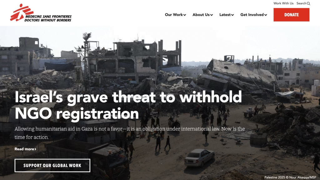
The Doctors Without Borders (Médecins Sans Frontières) website shows this approach clearly. Its homepage opens with a strong image of field teams or volunteers, paired with strong messaging which draws attention and frames the visit.
As users scroll, big impact numbers, strong headlines, and clear learn-more links guide the whole journey online. The site is updated often with fresh stories, news, and blogs, showing that the mission is active, urgent, and rooted in real impact today.
Strong Calls-to-Action (CTAs)
Clear, easy-to-see calls to action help visitors move from interest to action without any confusion. When options like donating, volunteering, or signing up are easy to find, supporters are more likely to engage rather than leave unsure of what to do next.
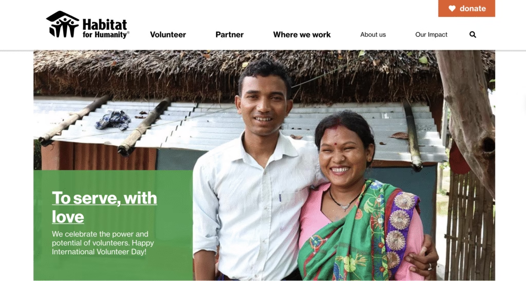
The Habitat for Humanity website demonstrates this well. A bright orange donate button sits up in the corner, clearly showing where to give now.
When options like donating, volunteering, or signing up are easy to find, supporters are more likely to engage rather than leave unsure of what to do next.
As you scroll, prompts like “connect with us,” “find your local Habitat,” newsletter sign-ups, volunteer spots, and repeat-donate buttons appear naturally across the homepage. These prompts stay visible and easy to tap so that visitors can take action at any point during their visit or journey.
Simple and Intuitive Navigation
When a nonprofit website is easy to navigate, visitors can focus on understanding the mission instead of figuring out where to click next. Clear menus and logical structure help people quickly find programmes, stories, and ways to get involved, which builds trust and keeps them engaged.
A strong example of this is the Girls Who Code website. At first glance, the homepage centres the organisation’s mission, with photographs of the girls they serve, so the purpose feels clear immediately. A simple, tidy menu guides visitors through programmes, events, and easy ways to join in.
A simple, tidy menu guides visitors through programmes, events, and easy ways to join in.
Despite covering complex initiatives such as summer camps, clubs, and college prep programmes, the site never feels overwhelming. Information is grouped sensibly, colours are used thoughtfully to improve readability, and key sections are easy to return to, helping users move through the site with confidence and clarity.
Accessibility Features for All Users
Accessibility ensures that a nonprofit’s website can be used by everyone, including people with visual, auditory, cognitive, or motor impairments. When you bake in accessibility from the start, the site gets easier for everyone and shows the organisation’s commitment to inclusion and equity.
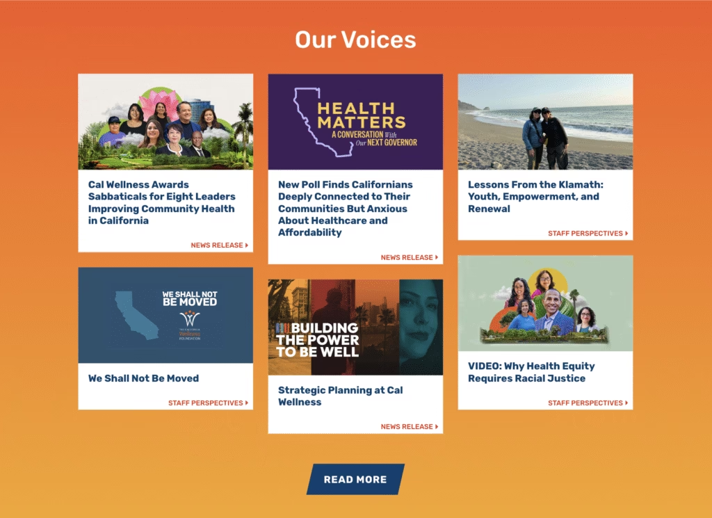
Look at the California Wellness Foundation website. It follows Level AA WCAG, with strong colour contrast, sensible headings, and pages that screen readers move through cleanly. Images include alt text, so the meaning holds even when the pictures are not visible. The menu stays plain and clear with “Mission,” “Community,” and “Take Action,” so people find what they need quickly.
Alongside these technical choices, the site uses people-first visuals and clear language to build an emotional connection without compromising accessibility. As a reference point, Cal Wellness shows how thoughtful design can balance inclusivity, clarity, and strong visual identity.
SEO Optimisation and Discoverability
A nonprofit website should be easy to find for people already searching for the issues it addresses. Strong SEO and discoverability ensure that mission-driven content reaches beyond existing supporters and appears clearly in search results when someone searches for information, data, or ways to help.
Malala Fund’s website stays focused on clear themes like girls’ education, school access, and hurdles to secondary education, using plain language that matches what people search for.
Malala Fund’s website shows solid SEO basics in its writing and build. It stays focused on clear themes like girls’ education, school access, and hurdles to secondary education, using plain language that matches what people search for. Navigation is tidy and well organised into sections such as “Why Girls’ Education,” “Our Work,” and “News & Voices,” which help readers and search engines navigate the site with ease.
Evergreen guides, data-backed explainers, and regularly updated stories add depth and freshness, and together they keep the site visible in search. Clear, descriptive headlines and well-structured pages make the site readable for users while also signalling relevance to search engines.
Closing the Loop: First Impressions That Stick Online
If your website works like a business card, every design choice shapes what people read from it. Whether it feels clear or cluttered, welcoming or confusing, careful or rushed. For many, this first touchpoint sets the tone for how seriously they take your work and whether they continue engaging with you today.
The examples above show that strong nonprofit websites are not chasing flash. They lean on clarity, ease, accessibility, and storytelling that respects a visitor’s time and intent. When these pieces click, the site works quietly and well, letting the mission speak plainly for itself, day after day.
If you’re enjoying this blog and want practical, usable tips for telling your nonprofit’s story clearly and meaningfully, subscribe to our newsletter. We share insights, trends, and real examples from the nonprofit storytelling world to help you connect better with donors, volunteers, partners, supporters, and peers everywhere.