Pregnancy is often wrapped in silence and half-knowledge, not because people do not care, but because many are unsure how to speak about it. When children meet these ideas early, explained clearly and in an age-appropriate way, it becomes easier to understand what is happening, and that space for fear and misinformation starts to shrink.
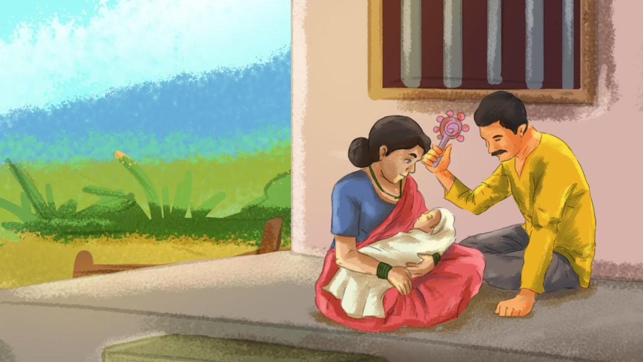
To support this kind of learning, Pratham Open School released a series of 10 short Hindi videos on pregnancy and child development. For their Hindi YouTube channel, with around 215K subscribers, Pratham released 10 short videos, each under five minutes, explaining pregnancy, foetal development, and key bodily changes. They approached us to design and produce the series using 2D animation.
Why Animation Was the Right Medium
From the start, animation felt less like a style choice and more like a responsibility. The subject matter needed to be handled gently, and the audience needed information that was clear without being heavy. Filming sensitive biological topics often requires controlled settings, careful casting, and detailed production planning. Even then, there are questions of privacy, appropriateness, and what can or cannot be shown.
From the start, animation felt less like a style choice and more like a responsibility.
Also read: Why Animation Works for Nonprofits
With 2D animation, those constraints ease. We can visualise processes that are impossible to film, simplify what would otherwise look intimidating, and guide attention exactly where learning needs to happen. Animation also gives you the freedom to represent the body and its changes in a way that is informative without being graphic or uncomfortable, which matters when the viewer is a student.
Perhaps the biggest advantage was control. In educational content, clarity is rarely accidental. Animation lets you design for clarity. You can slow down a moment, visually repeat a concept, highlight a detail with an icon, and build familiarity through consistency. Instead of asking the viewer to keep up, you can meet them where they are.
Our Approach to Making the Videos
Once Pratham shared the scripts, our focus shifted to translation, not of language, but of meaning. The challenge was never just to animate what the script said. It was to make sure the viewer understood it. For that, we treated every video like a short lesson with one central takeaway. Anything that distracted from that core idea was trimmed visually, even if it was technically possible to include.
Storyboarding followed a simple, disciplined process. First, we sat with the script until the learning point was clear, then we searched references on YouTube and other explainer formats to understand how similar ideas were shown. From there, we planned frames that expressed the same concept in a simpler, more visual way. We kept the structure largely intact, adding value mainly through smoother transitions between steps, scenes, or time shifts.
We kept the structure largely intact, adding value mainly through smoother transitions between steps, scenes, or time shifts.
We began with research and references, studying how other educational explainers handle biology for young audiences, and noting where they become too cluttered or too scientific. That early review helped us set a simple rule: keep scientific terminology minimal, keep visuals readable, and keep the pacing calm.
We chose a clean 2D style and kept motion minimal. We moved away from a glossy, polished vector look because it felt too clinical for young audiences. Instead, we used a hand-drawn feel with visible brush strokes and light texture. Colours stayed lively but softened into pastel tones, inspired by Studio Ghibli’s balanced palettes, and adapted for clear, mobile-friendly viewing.
Also read: How Animation Helped Upaya Tell a Story of Dignified Jobs
The use of text on the screen became an important aspect of the learning process. We used on-screen text to highlight key words and points, ensuring that viewers did not rely on the voice alone for comprehension. Also, timed the appearance of icons precisely when they were needed, which helped keep the screen uncluttered.
We handled sound with the same restraint. Background music stayed light and non-intrusive, so the narration and on-screen information remained the main focus. The aim was to support attention, not pull it away.
Designing for Comfort, Not Just Information
Because pregnancy is both biological and deeply personal, we kept returning to one question while designing: Will this feel safe to watch and easy to understand? That question shaped every decision, from colour and composition to how much detail to show, and how long to stay on each visual.
In the end, the series is built to do one thing well: make a complex life process understandable to children. The goal was not to overwhelm learners with detail, but to give them clarity they can carry, revisit, and share.
When education is designed with that kind of care, it does not just teach; it transforms. It equips. And that is what this series set out to do.
If your organisation is working to make complex ideas accessible, animation can help communicate them with care and clarity. We would be glad to support you in shaping your next learning or awareness initiative.