In many urban slums, menstruation unfolds quietly in the background of a girl’s life. It shapes her school hours, her confidence, and how safe she feels using the nearest toilet. These realities rarely appear in public conversations, yet they determine whether a girl participates fully in her day or withdraws because she simply doesn’t know where to change a pad or who to talk to about the pain.
When Vacha Charitable Trust reached out to us at Simit Bhagat Studios, they wanted to bring these lived truths into the open. Their team had just completed a detailed study on menstrual hygiene among adolescent girls in the bastis of Mumbai and Thane. The findings were urgent. However, they needed a medium that could carry both sensitivity and clarity. Together, we decided an animated explainer film would be the right format to speak to policymakers, educators, and the public without exposing any girl’s identity.
So, let’s take a look at how some decisions were made, why certain tools were used, and what each creative choice was designed to protect, reveal, or amplify.
Why Animation Became the Medium
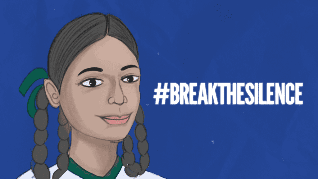
From the beginning, Vacha was clear about the heart of the problem: silence. Girls often receive their first period without any prior knowledge. They hide cloth, skip school, and navigate myths passed down through generations. Documenting this on camera inside homes, shared toilets, or school corridors would mean pointing a lens at deeply private spaces. It risked invading the very dignity we were trying to defend.
Animation allowed us to build scenes inspired by real testimonials without showing any girl’s face or location.
Animation offered a respectful alternative. It allowed us to build scenes inspired by real testimonials without showing any girl’s face or location. This protection was central. Animation also enabled moving between lived experience, data, and policy needs in a seamless narrative. It gave us control over pacing, tone, and symbolism in ways live-action could not.
Building the Script From Research
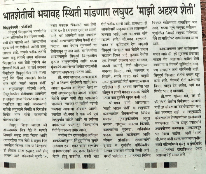
The script began with Vacha’s study, which mapped menstrual hygiene practices, product use, access to toilets, challenges with disposal, and the emotional burden surrounding periods. We treated this study as the spine of the film. Every line in the script answered one question: what does a viewer need to understand, and what must be included to honour the girls’ experiences?
We selected key findings that showed both scale and lived reality. And interestingly enough, during scripting, the government announced it was drafting a policy on menstrual health. This shifted our timeline. The film needed to be ready quickly so Vacha could use it to communicate ground realities to policymakers. Thankfully, we were able to achieve just that.
Designing a Visual Language That Feels Real
To create the film’s visual identity, we began with Vacha’s brand colours. Their red and grey became the anchors, and we built a wider palette around them: muted browns for lanes, soft creams for home interiors, and desaturated tones for clothing. Real basti environments are textured, layered, and often imperfect. We wanted that in the film without turning poverty into a visual motif.
The storyboard translated every script sentence into a frame. If the line mentioned fear, the visual needed to carry that sense without drama. If we showed disposal challenges, the image had to be clear but not sensational.
During feedback sessions, the Vacha team helped refine these visuals. They pointed out gestures that needed to be more grounded, clothing that required accuracy, and domestic details that helped situate the film in the correct setting.
Animating With Restraint
Our animation approach was simple: move only where movement mattered. Menstruation carries enough weight on its own. The film didn’t need dramatic transitions or flashy motion.
The camera drifted slowly instead of zooming abruptly. Characters breathed, shifted slightly, or adjusted their clothing. Thus, these small motions kept the world alive without distracting from the message.
Sound played an equally important role. And so, we used multiple voice-overs instead of a single narrator. The aim was authenticity. These voices represent thousands of similar stories; the narration needed to sit gently alongside them.
Background sound was minimal, like faint ambient noises. This made the space believable without overwhelming the testimonial.
Editing For Clarity And Dignity
In post-production, we balanced three things: the flow of the narrative, the readability of data, and the emotional weight of each testimonial. Statistics were shown in simple, spacious compositions.
We avoided overwhelming the screen with numbers. Meanwhile, the testimonials were layered carefully so they felt like voices in a shared room. This was intentional, as menstrual dignity is not one girl’s story but a collective one.
A Film Made For Change
For Vacha, the film is now a tool for advocacy. It is used in meetings, community discussions, and policy conversations to show the link between dignity, infrastructure, and the right to information.
For us, it reinforced a core belief: when design, research, and empathy move together, communication becomes more than awareness. It becomes a bridge between lived reality and decision-making.
If your organisation needs to bring a sensitive issue into public view with honesty and care, animation offers a path. We would be glad to help you build a film that carries your message with the intention, humility, and clarity it deserves.
Client: Vacha Charitable Trust
Creative Director: Simit Bhagat
Research and Script: Divya Shree
Illustrations: Kumar Shradhesh Nayak
Animation and Editing: Rohan Krishnan
Voiceover: Simona Terron
Character Voices: Divya Shree
Nrupali Kendale and Sahil Todankar