A student lies awake at night and scrolls through notes and notifications, wishing sleep would arrive before sunrise. The next day unfolds in a familiar loop with alarms, deadlines, and fewer real conversations. For many young people, silence and struggle now sit side by side.
This is the reality that nearly 1,750 college students across India described in a study by the Aditya Birla Education Trust (ABET). Sleeplessness, stress, and loneliness were not rare moments. They were repeated patterns that affected well-being and the classroom experience.
When ABET reached out to us to design their report, Unveiling the Silent Struggle, we knew it had to do more than present findings. It needed to draw attention to an issue that often stays out of sight. Our job was to make sure the research could be clearly understood and also genuinely felt.
Our Design Approach
We first explored the visual language through a short internal presentation for ABET. We used guiding line elements and a calm palette that reflected the organisation’s identity. When the work moved into a full research report, we kept that base and rethought the rest.
The task was to turn a heavy manuscript into a reading experience that informed without overwhelming.
The report has considerable academic content, which considers methodology, data interpretation, the purpose of mental health indicators, survey parameters, observations in detail, and more. The task was to turn a heavy manuscript into a reading experience that informed without overwhelming.
Also read: Uncovering the Invisible: Designing a Story-Driven Impact Report on MSMEs and Corruption
Bringing Calm Into the Visual Language
Because the subject is mental health, the design needed to feel steady and professional. We tested ABET’s brand colours of blue and yellow in different combinations. Yellow added energy, but on its own it felt too bright for the tone of the study, and together, the balance did not sit right.
A blue-led palette worked best. Clean shades of blue and white signalled trust and clarity, while small touches of yellow acted as quiet accents that kept the report connected to ABET’s visual system. We paired this with gentle typography and generous spacing to slow the pace slightly, reduce visual noise, and let the content breathe.
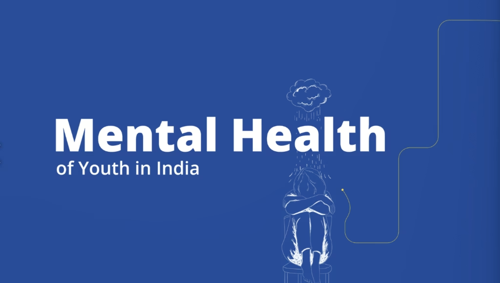
Illustrations that Respect Privacy and Promote Empathy
The study drew on confidential survey responses, so photographs were neither available nor appropriate. We developed a simple illustration system instead. It showed both urban and rural contexts and maintained a balanced mix of male and female students. We avoided stereotypical depictions of distress.
We developed a simple illustration system which showed both urban and rural contexts and maintained a balanced mix of male and female students.
The scenes remained familiar and grounded in everyday life, such as a late night of study, a moment of sport to ease stress, or a conversation with parents or peers. Where a universal cue helped, we used a low-battery icon near the head to suggest mental fatigue. The illustrations supported the content, protected dignity, and never competed with the research.
Also read: How Organisations Are Using Storytelling to Talk About Women Empowerment
The cover brought the themes together in one place. Small illustrations of student behaviour, stress, communication, and coping formed a connected visual field. It set expectations before a reader turned the first page and suggested a simple truth.
The experience can feel isolating, yet many students are living through something similar. The same visual language continued inside, so the report told one coherent story from beginning to end.
Designing for Dignity
This project reminded us that design is not only about aesthetics, it is also about care. Mental health studies ask for a communication style that is thoughtful and respectful, acknowledging the vulnerability without spectacle, and presenting the data without losing sight of the people behind the data. ABET now has a report that holds the seriousness of its findings while staying warm, clear, and accessible for stakeholders.
At every stage, our aim stayed the same. Help readers understand and help students feel seen.
At Simit Bhagat Studios, we turn complex research into communication that people can follow and trust. If your organisation is working in education, mental health, or any field where impact should be understood with care, we would be glad to help you shape findings into a story that connects. Contact us today!