In Shastri Mohalla, East Delhi, Arti was three months pregnant when she realised she had missed registering at an anganwadi. The services existed, but the pathways to reach them were unclear. Two anganwadi centres served her area, and she was unsure which one she belonged to. That uncertainty delayed care at a moment when timing mattered.
It was only after she met a community mobiliser from the ARMMAN’s Centre for Advocacy and Research (CFAR) team that things began to move. With guidance from frontline health workers, her details were uploaded to the government portal, her phone number was registered for Kilkari calls, and she began receiving regular information on maternal and child health. What changed her experience was not the presence of services alone, but the systems that helped her reach them in time.
Arti’s story reflects what ARMMAN is trying to protect women and families from: being left to navigate the health system on their own. Across states and programmes, the focus stays steady on making maternal and child healthcare easier to reach, on time, and dependable. Technology plays a role, but so do partnerships and on-ground support, because access only matters when it actually works for people.
Technology plays a role, but so do partnerships and on-ground support, because access only matters when it actually works for people.
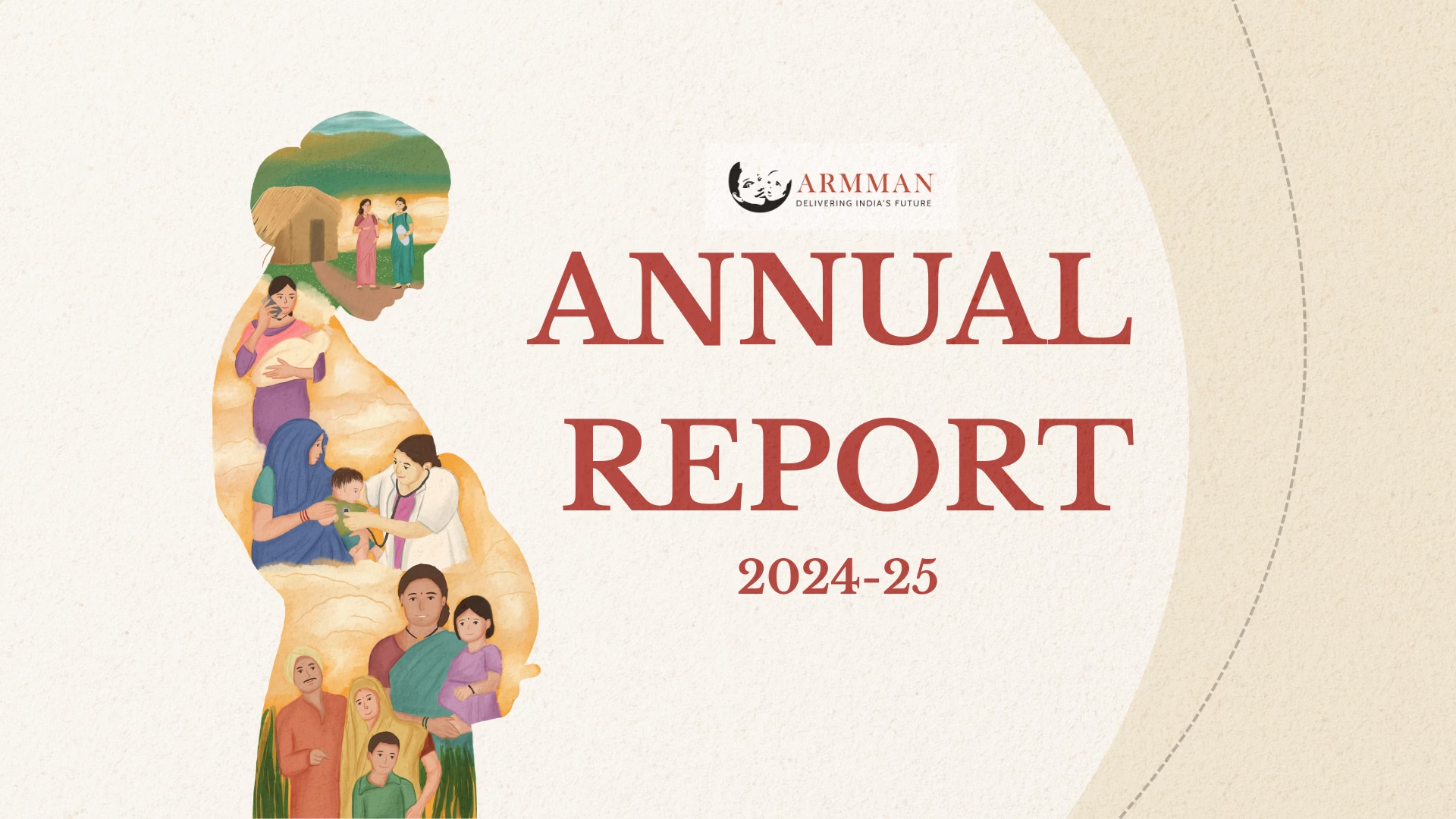
With that responsibility in mind, ARMMAN approached us to design their Annual Report for 2024–25. It was our second year working with them. The previous report, for 2023–24, marked 15 years of impact and was shaped by looking back. This year’s report needed a different tone. It was not about celebration. It was about continuity, scale, and growth.
Also read: Designing Impact: The Story Behind ARMMAN’s Annual Report
The theme for the 2024–25 report was growth. Not growth as a headline achievement, but growth as something gradual and sustained. The kind that happens when systems deepen, programmes expand, and trust builds over time.
Why Illustration
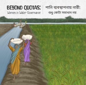
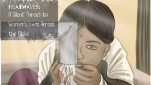
For this report, we chose to rely largely on illustration. And this was a conscious decision. Annual reports in the health sector often feature dense text and data. Illustration offered a way to organise that information without overwhelming the reader.
Illustration also allowed us to work around familiar challenges. Photographs can be limiting when the right images are unavailable, when privacy needs to be protected, or when beneficiaries should not be placed directly at the centre of visual attention. Illustration creates space to represent people, processes, and systems with care, without exposing individual identities.
Illustration creates space to represent people, processes, and systems with care, without exposing individual identities.
Even in the leadership sections, including the Founder’s and CEO’s messages, we chose illustrated portraits over photographs. The choice was partly about keeping the report visually consistent from start to finish. More importantly, it kept the reader’s attention where we wanted it, on the organisation’s mission, not on individual personas.
Also read: How Nonprofits Are Using Comics and Illustrated Stories
Our Visual Approach
The idea of growth guided every design decision. Across sections, we used recurring tree illustrations to hold the growth theme together. The intent was simple: to reflect an organisation that is steadily expanding, with deeper roots and a wider reach. Programmes are shown as part of a shared ecosystem rather than isolated efforts.
Data was handled with similar care. Large, bold numerical highlights were placed inside soft, rounded visual containers, allowing key statistics to be absorbed without distraction. For instance, numbers on antenatal care, anaemia, and child nutrition are placed right next to clear explanations, so the figures do not sit there as isolated statistics, and the meaning stays visible.
Across the report, we used visual metaphors to show progress over time: the “Highlights of the Year” is imagined as steps a child climbs with a mother’s steady support, while the ring-stacking toy appears incomplete at first and gradually becomes whole, reflecting how ARMMAN helps families build knowledge, confidence, and healthier outcomes step by step.
Across the report, we used visual metaphors to show progress over time.
Technology, which sits at the centre of ARMMAN’s interventions, was shown through everyday use. Women appear to be holding phones, speaking, listening, and sharing information within groups. The focus stays on people, not devices. Even the organisation’s mobile-friendly website was represented as an accessible tool rather than a design feature.
Designing for Clarity and Care
The report includes substantial text because ARMMAN’s work is layered and detailed. To keep it readable, we used icons and visual breaks to give the eye a break, and we placed quotes from beneficiaries and frontline workers with care, so the pages stayed human and easy to navigate. These voices add depth without interrupting the flow of information.
Working on this report reinforced an important idea. Growth in the social sector is rarely sudden. It is built through consistency, thoughtful design, and attention to how information is shared. When communication is approached with care, it can make complex work understandable without flattening its depth.
If your organisation is carrying a story of growth, continuity, or systems at work, illustration can help hold that story with clarity and dignity. We would be glad to help you tell it in your next annual report.