At the first mile of India’s waste economy, a collector or small aggregator may already have the experience needed to run an enterprise. However, what is often harder to access is affordable capital. Mool Capital was established to address this gap by connecting nano and micro waste entrepreneurs with Community Support Organisations, lenders and grant providers.
Therefore, this challenge became the starting point for the project. The identity needed to show that value begins at the source and that capital can help first-mile enterprises become viable and investable.
The Project Brief
Mool Capital came to us for a complete brand identity, followed by a website based on the same system. The work included the logo, colour palette, typography, graphic elements, applications and usage guidelines.
Mool operates between two environments that are rarely represented together: institutional finance and the realities of waste collection and aggregation. As a result, the brand had to feel credible to banks, Non-banking financial companies (NBFCs), grant providers and partners while remaining connected to entrepreneurs working on the ground. At the same time, it needed to stand apart from generic financial identities without becoming playful or informal.
Turning the Name into the Core Idea
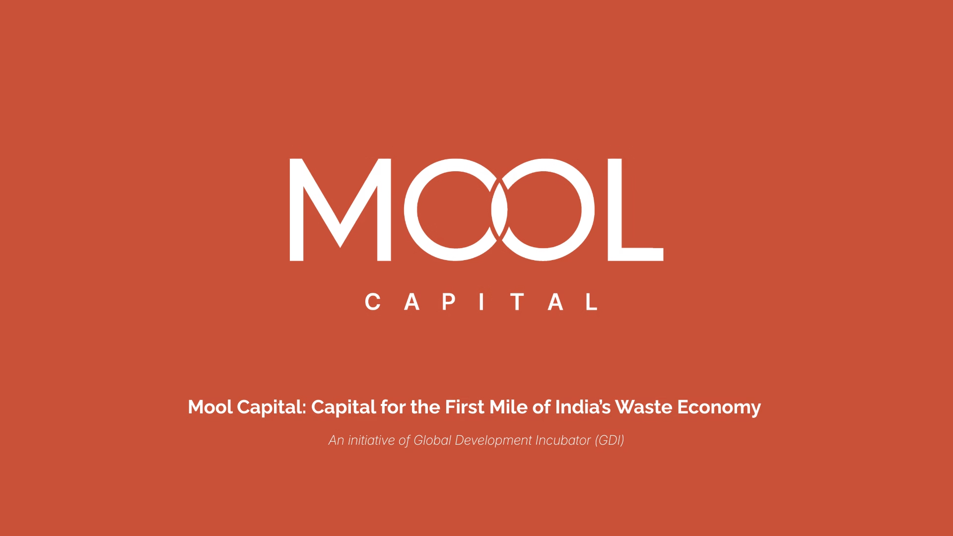
The logo began with the meaning of “Mool”. In Hindi, it can refer to the root or origin. In addition, in finance, it means principal, the base capital on which returns are earned.
We used the two O’s as the centre of the wordmark. Their overlap forms a pointed oval resembling a seed. It represents capital meeting community and growth beginning at the root. Moreover, the circular construction refers to the circular economy, connecting the logo to Mool Capital’s financial model and sector.
Choosing Colours from the Field
Rather than relying on a conventional financial palette, the colours were drawn from first-mile working environments. Earth Clay refers to soil and sorting floors. Meanwhile, Mineral Blue represents capital and collaboration. Solar Yellow draws from haldi, brass and marigold tones. Deep Charcoal recalls machinery, ink and ash, while Off White supports readability.
Together, therefore, the colours allowed the brand to feel grounded, optimistic and credible without losing the seriousness expected from a financial institution.
Building a System Beyond the Logo
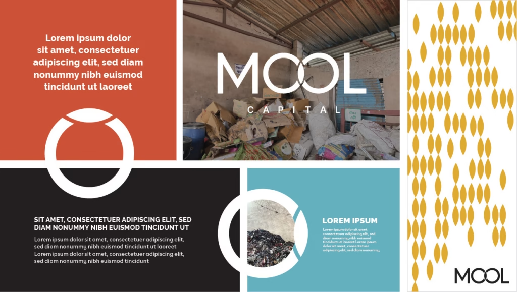
The overlapping circles generated a flexible set of graphic elements. The Seed isolates the pointed oval at the logo’s centre. Similarly, Seedfall repeats it as a pattern suggesting both scattered waste and unrealised potential.
As a result, these elements could frame photographs, highlight statistics and organise layouts across reports, presentations, social media and field collateral. They also allowed the identity to remain recognisable even when the complete logo was not the dominant element.
Also read: How Loksadhana built learning and livelihoods on laterite ground
Once the guidelines were established, the website followed the same rules. Recurring circular forms, field photography, colour blocks and a clear type hierarchy kept the digital experience consistent with the wider identity.
However, visual consistency was not the only consideration. The system also had to work for different audiences. Lenders and investors needed clarity and credibility. Meanwhile, Community Support Organisations and sector partners needed to understand how the model connected capital, enterprise support and first-mile businesses. Therefore, this balance influenced the typography, imagery and page structures used throughout the website.
From Research to Final Delivery
The process began with research into finance and waste-economy organisations. Following this, we developed the wordmark, tested the palette and typography, created the graphic elements and applied them across sample communications.
Once the visual system had been established, the final brand book documented logo usage, colour combinations, type hierarchy, grids, photography rules and applications. The website was then designed using the same system, thereby ensuring consistency across Mool Capital’s public touchpoints.
The Final Outcome
Ultimately, the final identity gave Mool Capital a clear way to communicate a complex proposition: capital placed at the root can support enterprises, strengthen networks and improve the investability of an overlooked sector.
More importantly, the project demonstrates how a brand system can explain an operating model, not merely identify an organisation. Every part of the identity connects finance to the field and makes Mool Capital’s purpose easier to recognise.
At Simit Bhagat Studios, we turn complex information into clear communication. If your organisation needs a brand identity, website, report, film or campaign, we would be happy to communicate its work with clarity and care.