Udyogini had been doing the work quietly, consistently, and with purpose. For decades, the organisation supported women in rural India to set up businesses and become financially independent. An organisation setup up as a part of a World Bank initiative, its mission had grown stronger over time. Their impact had deepened. Yet their identity hadn’t kept up. So, when they completed 30 years, they chose to pause, and rebuild.
Partnering with Simit Bhagat Studios, they decided to rebrand. This wasn’t just a facelift. It showed who they had become.
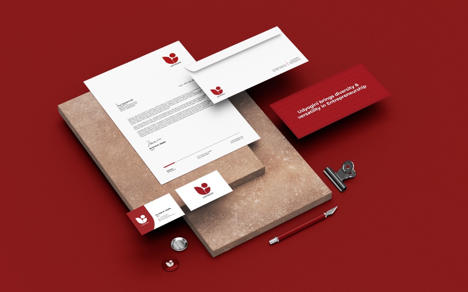
The new identity was based on a striking “U.” It had strong lines, curves that looked like women, and designs that were inspired by nature. It felt strong and graceful, just like the women they work with.
Everything from pitch decks to email signatures followed the new visual language. It was consistent, clear, and confident. Udyogini’s identity finally reflected their true work and caught up with their mission.
Their story is not unique. Many non-profits have meaningful missions but outdated or unclear identities. The work is valuable, but the story gets lost in translation. Branding changes that.
Many non-profits have meaningful missions but outdated or unclear identities.
Here’s a guide to building a strong brand identity for your non-profit, with lessons from five organisations doing it right..
1. Build a Visual Identity That Reflects Who You Are
Your visual identity, logo, colour palette, fonts, layout should say something about who you are and what you stand for. Think of it as a visual handshake. It’s how people meet your brand for the first time. It needs to feel like you.
Udyogini’s old identity was no longer doing justice to their work. It didn’t represent the grit and ambition of the women they empowered. Their new design changed that. The ‘U’-shaped logo brought movement and energy. With cohesive visuals rolled out across all materials, Udyogini became easier to recognise and much harder to forget.
2. Create a Design System That Earns Trust
Design isn’t just about beauty; it’s also about trust. People are more likely to engage with what feels familiar and reliable. The Red Cross understands this better than most.
Their logo, a red cross on a white background, is known around the world. But it’s not just the symbol that builds trust. It’s how consistently it’s used.
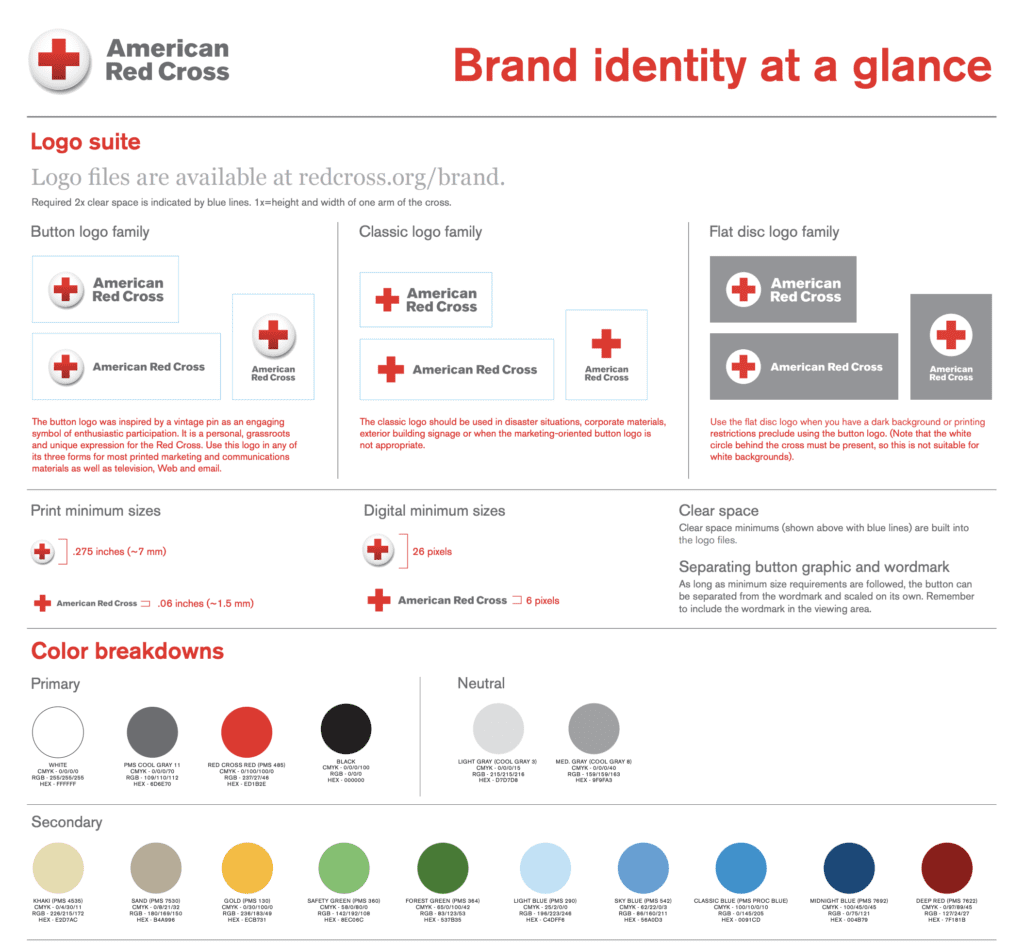
From brochures to billboards, they use a limited and thoughtful colour palette: red for urgency, greys and whites for calm and clarity. Fonts are chosen with care, Akzidenz-Grotesk for straightforward information, Georgia for storytelling and warmth.
From brochures to billboards, they use a limited and thoughtful colour palette
Even in a crisis, their identity doesn’t waver. That reliability sends a message: you can trust us to show up. For your non-profit, building that level of trust begins with consistency. Define your colours, fonts, and design guidelines, and stick to them.
3. Speak in a Voice That Matches Your Mission
Your brand voice is how your organisation sounds. It’s the language you use, the tone you strike, the way you speak to your audience. If you’re fighting injustice, your voice should sound bold. If you work in education, it might be nurturing and optimistic. The important thing is to be intentional and consistent.
Oxfam is a great example. Their work tackles some of the world’s most urgent problems: poverty, inequality, and climate change. But their messaging is never overwhelming. It’s clear, human, and accessible.
Your brand voice is how your organisation sounds. The important thing is to be intentional and consistent.
They don’t rely on statistics alone. Instead, they tell stories. And they steer clear of jargon. Their tone is confident yet inclusive. That’s what makes people feel connected. Oxfam doesn’t speak down to its audience; it brings them in. A strong voice builds community. It makes supporters feel part of the mission, not just donors on the sidelines.lines.
4. Tell Stories That Move People
We remember stories, not numbers. Yes, data is important. But stories are what make people care and do something.
Doctors Without Borders (Médecins Sans Frontières) tells stories that are based on facts. They show you what’s going on in places where there is war, medical emergencies, and refugee camps. And they do it in a fair way. You can’t hide the pain. But there is no exploitation.
We remember stories, not spreadsheets.
Their storytelling respects the dignity of the people involved. It shows courage, resilience, and the human side of crisis. That level of transparency creates a deep emotional bond. Donors don’t feel manipulated; they feel informed. And more importantly, they feel they can trust the organisation.
If your non-profit wants to build loyalty, start with real stories. Let your work be seen through the eyes of the people it impacts.
5. Make Your Brand Feel Bold, Personal, and Hopeful
Your brand should do more than inform; it should inspire. People want to feel something when they come across your work. They want to believe in the possibility. The Girl Effect gets this exactly right.
Their branding is loud, proud, and full of life. Colours are vibrant. Fonts are expressive. But most importantly, the message is clear: girls are powerful agents of change.
They don’t focus on what’s broken. They focus on what’s possible. Every campaign feels personal. It doesn’t say, “Here’s what’s wrong.” It says, “Here’s what we can do together.” That shift in perspective matters. It draws people in, not through guilt, but through belief.
They don’t focus on what’s broken. They focus on what’s possible.
Your brand should invite people to join you. To feel part of something big and bold and meaningful.
Final Thoughts: Let Your Brand Match Your Mission
Branding isn’t a luxury. It’s how your mission shows up in the world. It builds recognition. It builds trust. And it gives people a reason to connect with your cause.
Let’s recap what we’ve learned:
- Udyogini rebranded to reflect its leadership in women’s livelihoods.
- The Red Cross built a consistent, trusted design system.
- Oxfam created a voice rooted in justice and community.
- MSF earned trust through unfiltered, human stories.
- The Girl Effect inspired action through optimism and girl-led identity.
Each of these organisations-built identities that reflect their values. They made their presence match their purpose. Now it’s your turn.
Ask yourself: Does our identity reflect who we are? Is our brand easy to recognise, and easier to trust? Do we sound like the organisation we want to be? Are we telling the right stories? If not, maybe it’s time for a change.
Branding isn’t a distraction from your mission. It’s how your mission reaches the people who need to hear it.
If you’re passionate about communications and storytelling in the development sector, don’t miss out on our insights! Subscribe to our newsletter for the latest trends, tips, and stories on how visual storytelling is shaping social impact.