There’s something reassuring about a good annual report.
You open it expecting figures, graphs, and maybe a few updates, but every so often, you find more than that. You slow down. A phrase lingers. A photograph makes you stop. You feel something.
That’s when a report stops being just a report. It becomes a story.
This year, as we sat with NGO annual reports, we were not chasing big numbers or shiny statements. We kept coming back to thoughtfulness. To the quiet care in how each story was shared. To see whether there was a real balance between accountability and human connection.
Some reports leaned into colour. Others focused on quiet honesty. A few opened with notes that felt handwritten in tone and closed with visuals that stayed with us long after.
These five stood out, not because they shouted, but because they resonated. They took the time to tell us what mattered.
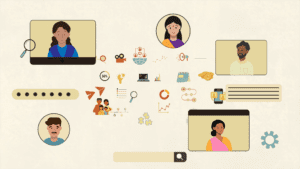
1. WWF-US Annual Report 2023
This annual report feels quietly confident.
Its design relies on soft colours, pastels and pale blues, that match the calm and care of WWF’s mission. Pages alternate between photo and text, making it easy to stay engaged.
The content doesn’t over-explain. Headings do the heavy lifting, and the writing is clean and steady.
While there aren’t many traditional illustrations, icons and neat infographics give structure to stats and financials without getting in the way.
The photography stands out. Every image feels connected to the work, landscapes, wildlife, and communities, framed with care.
In terms of length, it’s just right. Enough depth, but not demanding.
And the layout supports all of it. Nothing feels forced. Everything fits where it should.
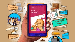
2. Educate Girls Annual Report 2023–24
The first thing you notice when you look through this report is a sense of movement. It feels a bit like watching a child sound out words for the first time, or walking past a class right in the middle of a lively lesson.
The design has a light, playful touch, but it still feels sharp. There are red highlights, small doodle-like drawings, and the soft curve of a paper plane’s dotted trail. All of it brings in the feeling of youth and the rhythm of community life.
The content arrives in small, easy pieces. Short snippets, little quotes, and compact blocks of story. Even the heavier parts sit gently because of how simply they are broken up.
The content comes in short pieces, small snippets, pull quotes and tight blocks of story. Because of that, even the heavier sections feel easier to sit with.
Illustrations pop up throughout: books, graduation caps, arrows, little visual cues that guide you forward and make you smile.
The photos are real and warm. Students, educators, families, captured mid-moment, not posed.
The length works well. It’s full, but not crowded. You can read it in one go or dip in and out.
And thanks to a clear layout, you never lose your place. It’s fun but focused.
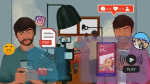
3. Girls Who Code Annual Report 2023
This report is built for the screen, and it’s a joy to move through.
It’s fully digital: animated, scrollable, and quietly delightful. Organisations like Smile Foundation are exploring similar formats, and it’s easy to see why.
The design uses layers of soft blue. When you scroll, text fades in, charts animate, and you feel pulled along, not rushed.
A standout moment: the CEO’s letter ends with her signature gently drawing itself in. A small gesture, but it sticks with you.
The Our Partners section has its own rhythm. As you scroll, testimonials appear one by one without the page moving, like someone reading them aloud.
Content is broken into short, clean sections. You click into what interests you. There’s no pressure to consume it all at once.
Photos and videos are embedded naturally. They support the story, never compete with it.
It’s a long report, technically, but you wouldn’t know it. Everything is sectioned, intuitive, and easy to explore.
The layout responds to how you read. It guides you quietly and lets you pause when you need to.
4. Water.org Annual Report 2023
Still, simple, and sure of itself, this annual report flows the way you’d expect from Water.org.
The design feels gentle and uncluttered. Soft blues and plenty of open space make you think of water that is clear and still.
Its content stays tight and focused. There is no extra fluff, just clear writing, thoughtful headings and sections that say what they need to say, then stop.
A few illustrations, mainly maps and pie charts, help summarise global reach and funding. They’re used sparingly but well.
Photos are strong without trying too hard. People are shown working, resting, carrying water, always in motion, always real.
The length is modest, but it doesn’t feel light. You come away with the full picture, no extras needed.
The layout gives everything space. You move through it steadily, without strain.
5. UNDP Annual Report 2023
The report comes across as big and bright, and there is a sense of ambition in it that feels like it is trying to reach out to the world.
The design is bold. From a rainbow-covered opening to ombré sections and starlit graphics, it makes you stop and look.
Its content carries weight, but it’s broken up with care. Each global theme, finance, climate, equality, is given room to unfold.
Illustrations and graphics are used throughout: maps, timelines, and bold icons. They bring structure to what could have felt dense.
Photos stretch across countries, projects, and partners. You can see the scale of work, and the care behind it.
It’s a long report, but it doesn’t drag. You can flip through or settle in for a deeper read.
And the layout? It keeps you on track, even when the topics are vast. It’s generous but never chaotic.
Helping Impact Speak for Itself
These five reports didn’t lean on sparkle or jargon. They leaned on honesty.
They gave space to people. To colour. To emotion. And they invited us, not just to learn, but to care.
In a field where trust matters more than polish, they reminded us that a thoughtful story, told well, can go a long way.
At Simit Bhagat Studios, we believe in that too. We work on reports that clarify, connect, and communicate impact with care.
Have a look at the annual report we worked on for ARMMAN and see how their journey comes through on every page.
Let’s shape your next report so it reads like a story people want to sit with and remember.