Illustration by Vivek Warang | Simit Bhagat Studios
When a petition stalls or a donation page bounces, we reach for better copy, bigger numbers, louder headlines. But the fastest lever is often silent: colour. It frames urgency before a word is read, signals who the work is for, and sets the emotional tempo that carries a reader from “hmm” to “I’m in.”
Research shows colour can shift emotions, direct attention, and even change behaviour. For nonprofits, where choices are moral as much as they are practical, colour is not just an aesthetic garnish; it is design for action.
Let’s take a closer look.
Why Colour Matters (and What Science Actually Says)
Psychologists Andrew Elliot and Markus Maier have shown that colour influences affect, cognition, and behaviour, but the effect depends on the situation. In an “achievement” context, red can trigger avoidance. In an “affiliation” context, the same red might heighten attraction.
This is the colour-in-context theory: some responses are biological, many are learned. Pink, for example, carries strong associations with breast-cancer activism because of decades of repetition. Designer Laura Guido-Clark sums it up simply:
“Colour is always speaking before the work… the colours have already told you something before words can even express it.”
For campaigners, that means palettes should be chosen for the moment, not just the stereotype.
Emotions and Culture: Universal Patterns, Local Nuance
Large studies show broad patterns, red with arousal, blue with calm, but intensity and meaning vary by culture.
For India-facing campaigns, colour carries civic weight. Saffron suggests courage and renunciation, white signals peace, green links to fertility and prosperity. Using these shades carelessly, especially during national moments, can create unintended signals.
Pantone’s Leatrice Eiseman calls colour the “silent salesperson,” reminding us that it shapes perceptions across branding, signage, and campaigns long before any copy is read. But to sell trust rather than product, NGOs must listen to the local nuance. As Eiseman puts it, “The power that colour wields is seen at every level of communication.”
What Different Hues Tend to Nudge
Red heightens caution and urgency. It is useful in disaster appeals, but can be fatiguing if overused.
Blue codes for competence and reliability. It works well to appease policy explainers, donors and provide reassurance
Green suggests renewal and balance. It’s quite valuable as it works very well in climate or livelihood stories.
Yellow / Amber commands attention and energy. For instance, Amnesty International’s high-contrast yellow/black system shows how effective this can be.
Neutrals carry dignity and restraint. Thus, it’s vital for sensitive themes like gender-based violence, where a loud palette can feel exploitative.
Case Snapshots: Colour as Strategic Shorthand
Amnesty International chose yellow and black for visibility and urgency. Their brand guide makes the yellow non-negotiable, ensuring protest posters can be read at a distance and in low light.
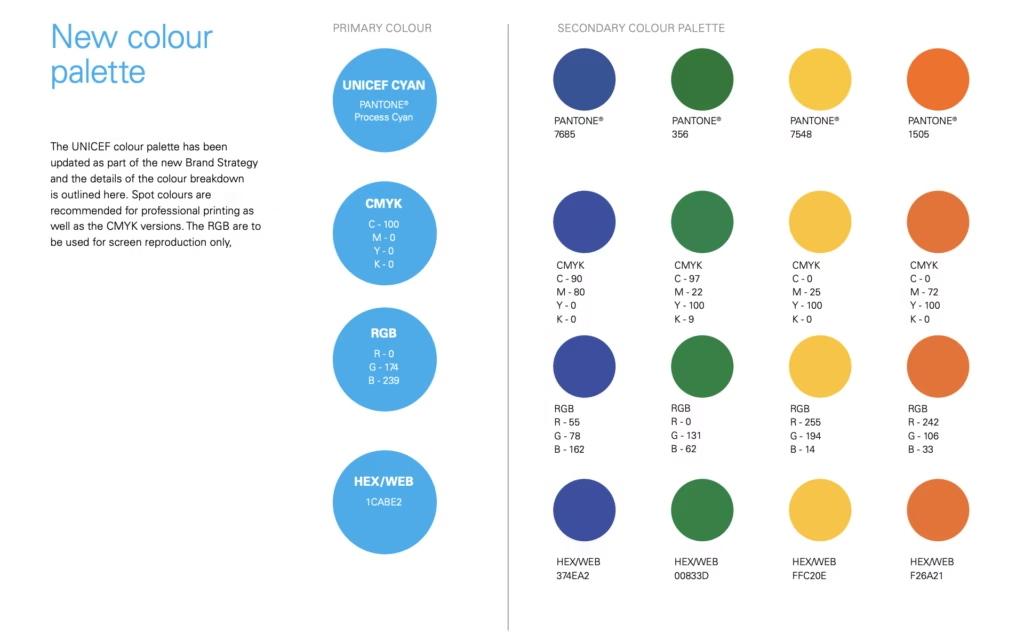
UNICEF codified “UNICEF Blue” across every market. Their brand book is explicit: “We are proudly UNICEF Blue … Repetition of our colour builds UNICEF’s brand awareness, so it is important to use it dominantly and consistently in everything we do.” They add: “UNICEF Blue denotes hope.”
Breast-cancer activism demonstrates how pink became a movement symbol, but also a warning of “pinkwashing” when commercial use stripped the colour of depth.
Red Cross and Red Crescent show how red on white became a legally protected emblem of neutrality and life-saving aid. This is colour with meaning beyond design.
Proper use of colour and its combination considerably influences fundraising campaigns and makes their management successful.
Even academic work on fundraising echoes this point: one study concluded that “proper use of colour and its combination considerably influences fundraising campaigns and makes their management successful.”
Accessibility Is Non-Negotiable
Colour choices can’t come at the cost of legibility. Accessibility guidelines recommend a minimum contrast ratio of 4.5:1 for text. For NGOs, this isn’t a technical detail; it’s inclusion. Campaigns often target older audiences or those viewing on mobile devices in low light. If your palette looks beautiful but isn’t readable, it fails.
“Use contrasting colours to highlight key elements … UNICEF Blue must be present in all messaging, and as a dominant colour.”
A still from the UNICEF Argentina’s publicly available graphic manual
Ethics and Optics
Colour can move people, but it can also manipulate. Blood-red posters for gender-based violence can veer into sensationalism. Pastel palettes that disappear against dark skin tones can unintentionally erase. And adopting a cause colour without alignment risks commercialisation, as seen in critiques of pink-ribbon marketing.
Designer Guido-Clark reminds us not to treat colour as a patch:
“The most important thing is to not think about colour as a ‘Band-Aid,’ but as an integral part of the design process.”
A Practical Playbook for Campaign Teams
Define the moment: Awareness, mobilisation, or conversion? High-arousal hues work early; trust-anchoring hues matter at the point of action.
Micro-patterns: Donation CTAs in high-contrast blue or green buttons; urgent alerts in red or amber strips; evidence blocks on a cool base with warm accents.
Prove your palette: Run five-second tests, A/B test live campaigns, track not just clicks but comprehension and recall. Build what works into your style guide.
Final Thought: Designing for Trust
Across science, design, and activism, the message is clear: colour is never neutral. It speaks before copy, lingers after images, and shapes whether people feel urgency, safety, or solidarity.
UNICEF insists on repetition of its blue for recognition. Eiseman calls colour the silent salesperson. Guido-Clark reminds us it communicates before words.
Want more real-world playbooks on how design and storytelling can deepen trust and drive action? Subscribe to our newsletter. Each edition brings lessons on ethical communication, campaign strategy and tools that help NGOs design with dignity and impact.
Rahul works on video editing and motion graphics across various formats. He previously worked in post-production at Sallys, with experience across commercials, web series, and digital content. He has over three years of experience in video editing and motion graphics. He enjoys reading, playing cricket, fish keeping and making short films. He holds a Bachelor’s degree in Mass Media (Journalism) and a Diploma in Filmmaking from Rachana Sansad Institute, Mumbai.
Mamata Salvi
Finance Specialist
Mamata is a Mumbai-based accounts and finance specialist with over two decades experience in a variety of industry sectors. She holds a Bachelor’s degree in Commerce from University of Mumbai. She is passionate about reading especially Marathi literature.
Subscribe to our newsletter
Sign up for our newsletter and receive exclusive podcasts, blog updates.
Swanand Deo
Web Development Specialist
Swanand Deo is a WordPress and Web Development Specialist working on various digital projects. With over a decade of experience in the design and development space, he has collaborated with over 50 national and international clients. He specialises in User Experience (UX) design, WordPress development, and creating engaging digital experiences. He holds a Bachelor of Fine Arts from the University of Pune.
Aashna Chandra
Graphic Designer
Aashna works on publications, UI/UX and branding projects at SBS. She has previously worked with organisations across the social impact and development space. Her work focuses on layout design, visual identity systems and user interfaces across print and digital formats. She studied at the United Institute of Design, Gandhinagar, specialising in branding, typography, editorial design and packaging.
Vivek Warang
Digital Illustrator
Vivek works on translating ideas into visual narratives. His work ranges from creating storyboards and illustrations to ideation for special visual storytelling projects. He previously worked as an illustrator at OckyPocky. He enjoys telling stories through images and bringing concepts to life through his drawings. He holds a Bachelor’s degree in Applied Arts from D.Y. Patil College, Pune, with a specialisation in Illustration.
Rajshree Goswami
Content Writer
Rajshree began her professional journey in Kolkata and has over four years of experience as a creative writer and proofreader for academic papers. At SBS, she works across all content, including blogs, transcripts, quality checks and writing for annual reports. She is an avid reader and enjoys cinema, fiction and creative writing. She holds a Bachelor’s degree in English Honours from West Bengal State University.
Bhavesh Dhote
Founder’s Office
Bhavesh is part of the Founder’s Office, working across in-house operations, social media strategy, strategic initiatives, market research and film production. He holds a Bachelor’s degree in Electronics and Telecommunications Engineering with a Diploma in AI and Machine Learning from D.J. Sanghvi College of Engineering, Mumbai. He is also a professional badminton player, marathon runner, trekker and plays euphonium and trumpet.
Manish Mandavkar
Motion Editor
Manish Mandavkar has studied animation at Arena Animation in Mumbai. He has previously worked on animated videos and motion graphics for brands, including Unilever and Zee Movies. An avid gamer, he is also passionate about sketching and photography. He holds a degree in Commerce from the University of Mumbai.
Joel Machado
Film Editor
Mumbai-based creative consultant and film editor Joel Machado has worked on documentaries as well as films in the mainstream Bollywood sector. He was also the Chief Assistant Director on the Jackie Shroff short, “The Playboy, Mr. Sawhney.” In addition to earning a B.Com from Mumbai University, he attended the city’s Digital Academy to hone his script writing skills.
Rohit Sreekumar
Founder’s Office
Rohit is responsible for developing strategic alliances and collaborative initiatives in the social sector. He also works on project management and helps internal teams stay on track. He has previously worked at early-stage startups across product and growth roles. In his free time, he enjoys binge-watching series, gaming and reading. He holds a Master’s degree in Computer Applications from Amrita Vishwa Vidyapeetham, Karnataka.
Aliefya Vahanvaty
Sr. Creative Partner
Senior Creative Partner, Aliefya Vahanvaty has worked in a wide range of editorial roles over the course of her career, gaining experience as a correspondent, copy editor, writer, photographer, and assistant editor at publications like the Times of India, Forbes India, Open Magazine, Impact Magazine, and others. In addition to her MA in Sociology from Mumbai University, she also has an MA in Photojournalism from the University of Westminster in the United Kingdom.
Simit Bhagat
Founder
Founder, Simit Bhagat has worked in the fields of filmmaking, project management, and journalism for over 15 years. He has served in a variety of positions for organisations like the Times of India, the Maharashtra Forest Department, the Tata Trusts, and the Thomson Reuters Foundation. From the University of Sussex in the United Kingdom, he earned a Master of Arts in Science, Society, and Development.