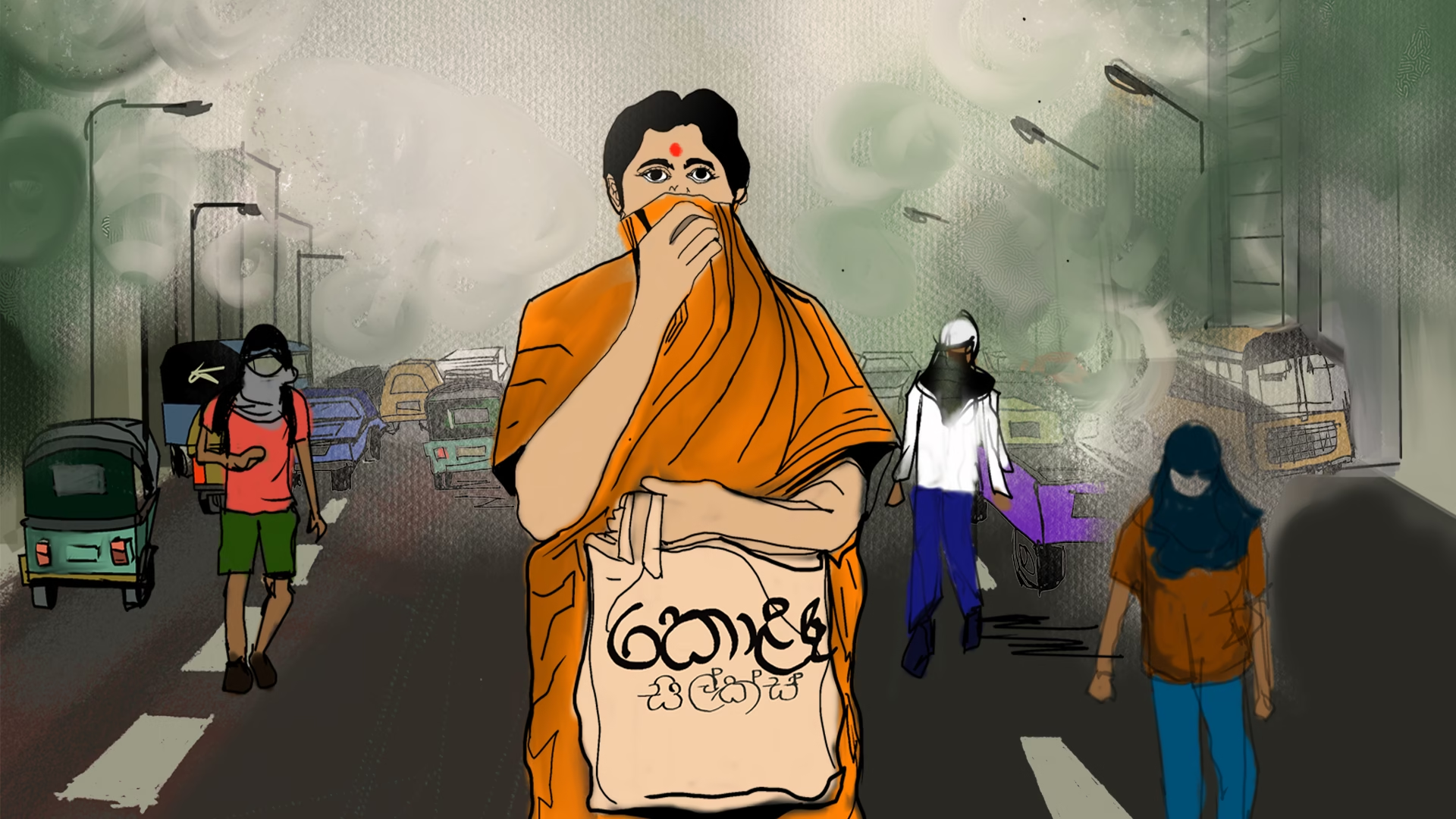
The air in the streets of Colombo was drawn in shades of grey. People covered their faces as traffic crawled past, and the weight of pollution felt heavier than the heat itself. This was not a photograph, but an illustrated moment created to show what poisoned air feels like to live inside. As the story unfolded, the skies slowly cleared, colour returned to the city, and breathing became easy again.
This is the power of illustration in the social sector. NGO work often deals with invisible struggles that need to be felt before they can be understood. Illustration gives that freedom. It lets stories travel where photographs cannot and imagination leads the way. So, come with us as we take a look at the many ways illustrations make impact visible.
Line-Based / Minimal Illustration
This format uses one continuous line to build a full image. It avoids heavy detail. Moreover, it keeps the idea sharp and quick to read. Additionally, the style can suggest movement, emotion, and tension with very little.
A strong example comes from Amnesty International Indonesia and Grey Indonesia. They turned petition signatures into single-line poster art. Furthermore, the same line hinted at both a signature and a human story. Also, the posters focused on child marriage, gender-related persecution, and limits on freedom of expression.
The clean line made the message feel urgent, not crowded. Additionally, it suited youth spaces like Menteng, and later stations and cafés. Overall, line-based minimal illustration works best when simplicity carries the weight.
Digital Paintings
Digital painting uses a tablet or screen instead of canvas. It keeps the feel of brushwork, but adds layers, undo, and easy colour changes. Moreover, artists can blend light, texture, and detail with strong control. Additionally, the final result has the abiluty to travel fast across social media and campaigns.
A clear example is Diala Brisly’s commissioned artwork for the International Rescue Committee’s 2021 World Refugee Day campaign. Her illustration carries the line “Refugees are Courageous” and shows refugees of different ages and identities standing with pride. Moreover, the digital format ensures that the message is strong, warm, and shareable.
And since the artwork is easily downloadable, supporters can share the message in seconds. Therefore, digital paintings assist in spreading complex messages through color, clarity, and care.
Realist Illustration
Realist illustration aims to look close to real life. It focuses on accurate faces, settings, and small details. Also, it makes serious stories feel real instead of abstract. Additionally, it can carry emotion without exaggeration.
The Photographer, based on Didier Lefèvre’s 1986 journey into war-torn Afghanistan with Médecins Sans Frontières is a great example of this. The book blends Lefèvre’s photographs with Emmanuel Guibert’s realist drawings and Frédéric Lemercier’s colour. Furthermore, this mix shows the harsh terrain, the improvised hospital, and Lefèvre’s culture shock with honesty.
The realistic style keeps the people he meets human, not reduced to stereotypes. So, to sum up, realist illustration works best when truth and detail are part of the story.
Folk and Indigenous Illustration
Folk and Indigenous illustration carries the feel of something made by hand and held in memory. It leans on cultural motifs, local symbols, decorative borders, everyday patterns, and a lived-in, imperfect charm that looks like it belongs to real people, not a studio.
It can show up across many mediums. This includes wall murals in schools, shelters, and public areas. It may also be found on signboards, handmade posters, community zines, textiles, and painted items.
At a shelter in Kolkata, Cup of Color has organised wall murals with shelter residents, allowing women and children to pick colors and symbols that represent home. The result is not just beautification. It is ownership, visibility, and a space that reflects life beyond hardship.
Flat Vector Illustration and Icon-Driven Visuals
In this style, you often see clean shapes, flat blocks of colour, and simplified people, paired with geometric trees, buildings, or hands. The result is a visual language that feels modern and neutral, and that most viewers can read at a glance, no matter where they come from.
WWF, for instance, usually selects flat and stylised posters of wildlife for events like World Wildlife Day, where illustration is preferred over photography in order to make the message more welcoming and less intrusive.
Such illustrations are very helpful when you are posting an explanation post, a website, a report, or an awareness campaign where you require clarity and calm communication rather than emotional images.
Data Illustration & Infographics
Data illustration turns numbers into pictures that people can read fast. It uses charts, icons, maps, and bold labels. Moreover, it helps audiences see patterns, scale, and change without heavy text. Additionally, it can guide the eye from problem to proof to action.
Oxfam used this approach in an infographic on the global land rush. Furthermore, it connects everyday sugar in drinks to land grabs that push small farmers off their land. The agency Killer Infographics pulled scattered facts into one clear story. Also, the layout uses simple comparisons, timelines, and a world map to show where land deals concentrate. Finally, it ends with a call to share and act.
Infographics are a great medium of sharing information as they make data feel immediate, memorable, and usable.
Character & Mascot-Based Illustration
This format uses a central character to carry the message. The character becomes familiar over time. Moreover, it makes behaviour change feel personal, not preachy. Additionally, mascots can model the “right” action in a way that feels friendly and easy to copy.
For example, SuperAmma handwashing campaign centres on a forward-thinking rural mother (SuperAmma), shown teaching her son good manners and regular handwashing with soap. Furthermore, the campaign adds a comical male character with unpleasant habits, so the contrast feels funny and clear.
Also, these characters appear across videos, community activations, and printed materials, which helps people remember the habit. So, character-led illustration works best when one face turns a lesson into a story.
Comic Books and Graphic Novel Style
Comic and graphic novel work relies on panels, speech bubbles, and recurring figures, all arranged so that the story unfolds frame by frame. The look can borrow from manga or lean towards realism, but what truly matters is how each panel builds on the last, letting tension, humour, or empathy grow steadily.
UNICEF has supported several comic based projects. One example is the superhero Cipta, created by young activist Rizka Raisa Fatimah Ramli for a comic on stopping violence in schools. When it was launched at the United Nations, Cipta’s story helped bring hidden forms of school abuse into open conversation.
This style is particularly effective at child protection, rights education, taboo topics, and long-form storytelling that requires emotional complexity.
Isometric Illustration
Isometric illustration illustrates a scene in a way that resembles 3D, with sharp angles and defined depth. It has a sense of organisation, as if it were a model that you could walk around. Moreover, it lets you pack many details into one frame without confusion. Additionally, it works well when you want viewers to scan, pause, and discover.
A strong example is the “Sustainable City” project created for United Nations Development Programme. The team built a detailed isometric city with more than 20 sustainable features. Furthermore, it was launched as an interactive animated site, so people could click through the city and learn each element. It also appeared at the World Urban Forum in Abu Dhabi.
Isometric illustration are a great option as they can make complex systems look structural and feel navigable and memorable.
3D Illustration
3D illustration builds a scene with real depth. It can feel like you are moving through a place, not just looking at it. Moreover, it helps audiences understand scale, distance, and damage quickly. Additionally, it is useful when the story depends on geography.
For instance, MapAction’s 3D visualisation and fly-through of hurricane-affected islands after Hurricane Beryl. It shows three Grenadine islands, Union, Mayreau, and Canouan, from an aerial view. Furthermore, the fly-through makes the impact easier to grasp than a flat map alone.
Also, the format supports rapid assessment work, because teams can share a clear picture with responders and decision-makers. Thus, 3D illustration turns complex terrain into a view people can understand and act on.
Where Stories Take Their Next Shape
From skies that change from grey to blue on the page to walls that begin to speak for the people who share them, illustration keeps reminding us that impact does not always need literal images to feel truthful. What it asks for instead is sincerity, imagination, and careful attention to how communities see themselves. Across different causes and contexts, illustrated storytelling continues to help NGOs surface what is hidden and give form to what is often ignored.
If this exploration of illustration styles sparked ideas for your own work and you would like to keep discovering how storytelling is evolving in the social sector, we share those conversations regularly. Subscribe to our newsletter for thoughtful updates on NGO storytelling trends, creative formats, and real-world projects shaping change.for thoughtful updates on NGO storytelling trends, creative formats, and real-world projects shaping change.